NextJS Starter with App Router - TailwindCSS + ShadcnUI (partially)
Craft an extendable starter with NextJS App router for use in your production apps. Use Tailwind and Shadcn for styling.
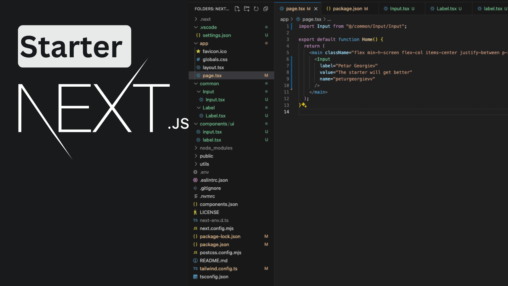
I've decided to create a NextJS starter that will be used in future projects. It is with the latest NextJS features like app router, caching, and more. For the styling, I've decided to start with TailwindCSS and partially with ShadcnUI, not because it's bad, but because I want more control over some parts.
It will be enriched with more features as time goes by. I've created a repository for it nextjs-starter. I'll skip the steps for creating a repository and start with the building and generating part.
This guide will be a step-by-step tutorial on creating the same starter that is inside the init branch if you decide not to "clone" this project or if you want a deep dive into its creation.
Generate and Install dependencies
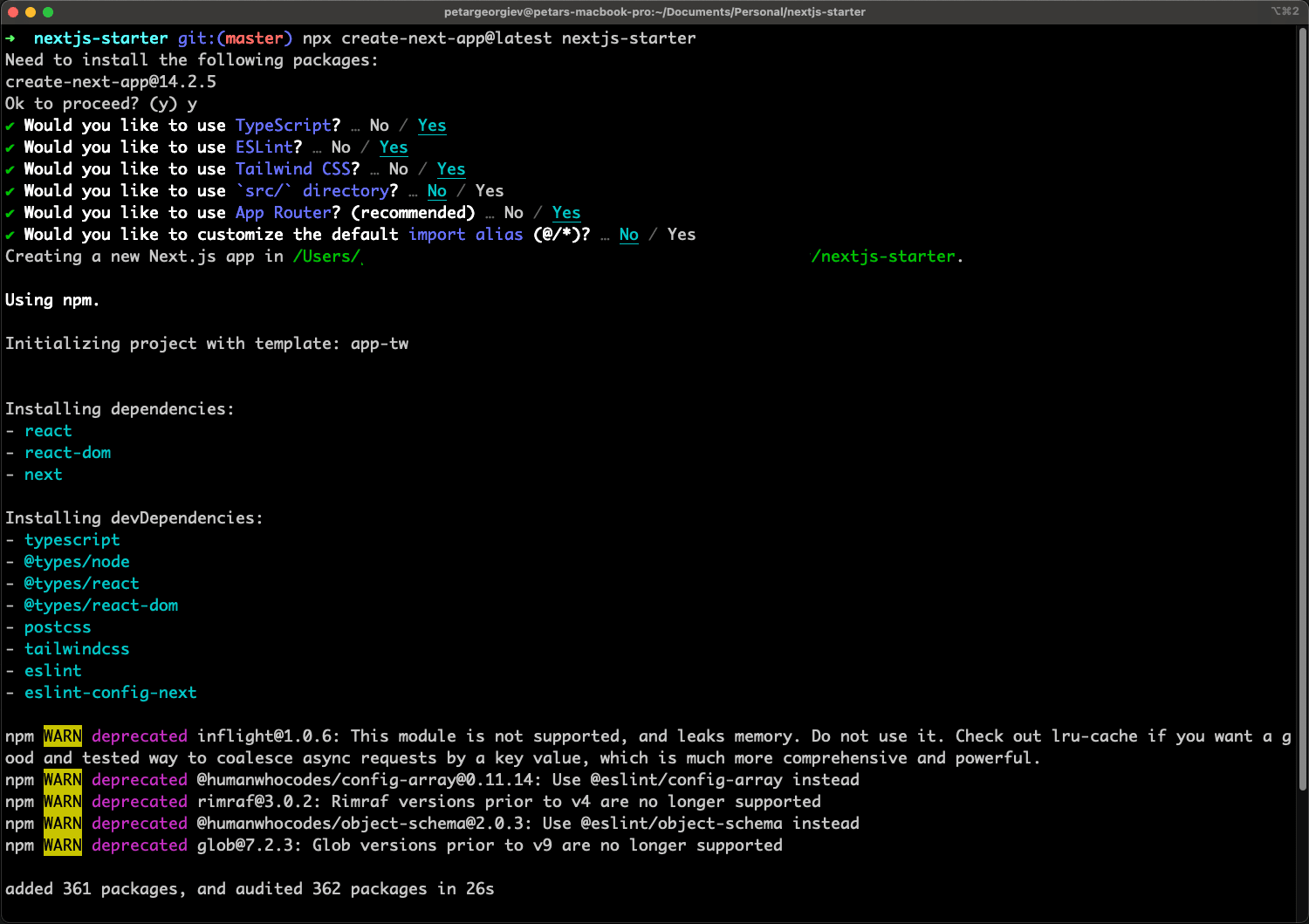
Our first move is to generate a project. Run the command to create the latest NextJS app. (I suggest using node 20)
npx create-next-app@latestMark the answers as in the photo and you will see an output similar to it.
We'll improve our typescript checking by adding another package concurrently as a dev dependency.
npm install concurrently --save-devBy doing so, we'll be able to run multiple commands in a single terminal. This will allow us to change the dev command. Open package.json and change dev to the below code.
"dev": "concurrently -n NEXT,TS -c magenta,cyan \"next dev -p 3051\" \"npm run ts --watch\"",As you might've noticed, we also added a change to the PORT of which we're starting the app. I prefer to do it, to avoid conflicts with other projects I might have. It's entirely up to you for both the steps, but I suggest you do them.
To continue with our dependencies, let's add shadcn/ui.
npx shadcn@latest initIt'll prompt us for a few questions and I always go by the default options. It uses Inter font, and it's easy to change, but we'll go with it. It's explained how to do so in shadcn docs, but I'll show it here as it's not sure when it might be changed. There is also code structure which I don't prefer so we're going to change some defaults.
Create a folder on the root level - utils. Inside a file shadcn.ts and copy the following content. (this is auto-generated from shadcn in lib/utils.ts which you can delete now)
import { type ClassValue, clsx } from "clsx"
import { twMerge } from "tailwind-merge"

export function cn(...inputs: ClassValue[]) {
  return twMerge(clsx(inputs))
}
As the structure changes, go to components.json and change the aliases. The full file should look like this.
{
  "$schema": "https://ui.shadcn.com/schema.json",
  "style": "default",
  "rsc": true,
  "tsx": true,
  "tailwind": {
    "config": "tailwind.config.ts",
    "css": "app/globals.css",
    "baseColor": "slate",
    "cssVariables": true,
    "prefix": ""
  },
  "aliases": {
    "components": "@/components",
    "utils": "@/utils/shadcn"
  }
}
The last two steps here are to go into layout.tsx and modify our code to use CSS variables for styling and add it to the body, as shown below.
import type { Metadata } from "next";
import { Inter } from "next/font/google";
import "./globals.css";
import { cn } from "../utils/shadcn";

const fontSans = Inter({
  subsets: ["latin"],
  variable: "--font-sans",
});

export const metadata: Metadata = {
  title: "Create Next App",
  description: "Generated by create next app",
};

export default function RootLayout({
  children,
}: Readonly<{
  children: React.ReactNode;
}>) {
  return (
    <html lang="en">
      <body
        className={cn(
          "min-h-screen bg-background font-sans antialiased",
          fontSans.variable
        )}
      >
        {children}
      </body>
    </html>
  );
}
Next for this to work, move to tailwind.config.ts and extend the theme with our font sans. You need the import and extend part for the fontFamily. Here we're also adding in content a new line for the common folder, where our components will stay.
import { fontFamily } from "tailwindcss/defaultTheme"

const config = {
  content: [
    "./pages/**/*.{ts,tsx}",
    "./components/**/*.{ts,tsx}",
    "./app/**/*.{ts,tsx}",
    "./src/**/*.{ts,tsx}",
    "./common/**/*.{ts,tsx}",
  ],
 ...
 theme: {
 	...
 	 extend: {
      fontFamily: {
        sans: ["var(--font-sans)", ...fontFamily.sans],
      },
Moving forward with the form
I'd like to keep this article short, as its main purpose is to be a skeleton for future ones. I'm going to include all the "boilerplate" we're going to use in the future. One thing we can't do without is forms, hence inputs. In my opinion, the form in Shadcn is not performant enough, as it uses context which I see no reason to do so, and might trigger useless re-renders.
We're going to build our own forms.
- Install needed form dependencies
- Add a common component to wrap our input logic
Run the following commands.
npx shadcn@latest add label
npm i react-hook-form @hookform/resolvers zod tailwindcss-animate
Our input will be custom, using the styled Input and Label components from shadcn. I've already generated and copied what is needed. We'll also add props to allow us to use it with RHF (react-hook-form) and without.
Create a new folder at the top level - common. Inside add another one named Input and one Label with a file inside each named Input.tsx and Label.tsx. The reason is that I like to wrap everything to my own components and avoid being "tied" down to a library. Let's start with our label.
import { Label as ShadcnLabel } from "@/components/ui/label";

type LabelProps = {
  htmlFor: string;
  label: string;
};

function Label({ htmlFor, label }: LabelProps) {
  return <ShadcnLabel htmlFor={htmlFor}>{label}</ShadcnLabel>;
}

export default Label;
The next one is the Input component. It's a complex wrapper that will be used with RHF and has almost everything needed to never use another one. It could be used without RHF, but I don't recommend or see a reason to do so.
import React from "react";
import { UseFormRegister, FieldValues, Path } from "react-hook-form";
import { cn } from "../../utils/shadcn";
import Label from "@/common/Label/Label";

const convertToValue = (value: string, type: React.HTMLInputTypeAttribute) => {
  if (type === "number") {
    const parsed = parseFloat(value);
    return Number.isNaN(parsed) ? value : parsed;
  }
  if (type === "date" && !value) {
    return null;
  }
  return value;
};

type InputProps<TFieldValues extends FieldValues> = {
  label?: string;
  name: Path<TFieldValues>;
  type?: React.HTMLInputTypeAttribute;
  dataTestId?: string;
  autoComplete?: string;
  placeholder?: string;
  register?: UseFormRegister<TFieldValues>;
  error?: string;
  helperText?: string;
  disabled?: boolean;
  className?: {
    wrapper?: string;
    input?: string;
  };
  min?: number;
  max?: number;
  value?: string;
  onChange?: (e: React.ChangeEvent<HTMLInputElement>) => void;
  onClick?: (e?: React.MouseEvent<HTMLInputElement>) => void;
  onKeyDown?: (e: React.KeyboardEvent<HTMLInputElement>) => void;
  onBlur?: (e: React.FocusEvent<HTMLInputElement>) => void;
};

function Input<TFieldValues extends FieldValues>({
  label,
  name,
  type = "text",
  dataTestId,
  autoComplete,
  placeholder,
  register,
  disabled = false,
  className,
  min,
  max,
  onChange,
  onClick,
  value,
  onKeyDown,
  onBlur,
}: InputProps<TFieldValues>) {
  return (
    <div
      className={cn(
        "grid w-full max-w-sm items-center gap-1.5",
        className?.wrapper
      )}
    >
      {label && <Label htmlFor={name} label={label} />}
      <input
        autoComplete={autoComplete}
        data-testid={dataTestId}
        id={name}
        name={name}
        type={type}
        placeholder={placeholder}
        className={cn(
          "flex h-10 w-full rounded-md border border-input bg-background px-3 py-2 text-sm ring-offset-background file:border-0 file:bg-transparent file:text-sm file:font-medium placeholder:text-muted-foreground focus-visible:outline-none focus-visible:ring-2 focus-visible:ring-ring focus-visible:ring-offset-2 disabled:cursor-not-allowed disabled:opacity-50",
          className?.input
        )}
        disabled={disabled}
        min={min}
        max={max}
        onChange={onChange}
        onBlur={onBlur}
        value={value}
        {...(register &&
          register(name, {
            setValueAs: (v) => convertToValue(v, type),
          }))}
        onClick={onClick}
        onKeyDown={onKeyDown}
      />
    </div>
  );
}

export default Input;
We'll not add more new components here to avoid complexity and allow for better reading in this tutorial.
Last changes
To wrap it up, let's show an Input with sample data. Open up /app/page.tsx and copy the below code.
import Input from "@/common/Input/Input";

export default function Home() {
  return (
    <main className="flex min-h-screen flex-col items-center justify-between p-24">
      <Input
        label="Petar Georgiev"
        value="The starter will get better"
        name="peturgeorgievv"
      />
    </main>
  );
}
Run the project and a very white screen with our Input should be shown as below. It's just a simple example that we're going to build upon.

This is enough for one article and to have your project started in an initial phase. I'm going to cover login and registration pages with their stylings to allow faster launches, along with next-intl translations.
If you have any questions, hit me up on Twitter/X or LinkedIn. At both places a follow is highly appreciated!
My newsletter will get you notified about any new articles coming out. You can subscribe below!
Related articles

How to improve your SaaS SEO & LLM's searches with NextJS (FAQs)
NextJS FAQs SEO boost. Increase your conversions with practial examples on improvements.
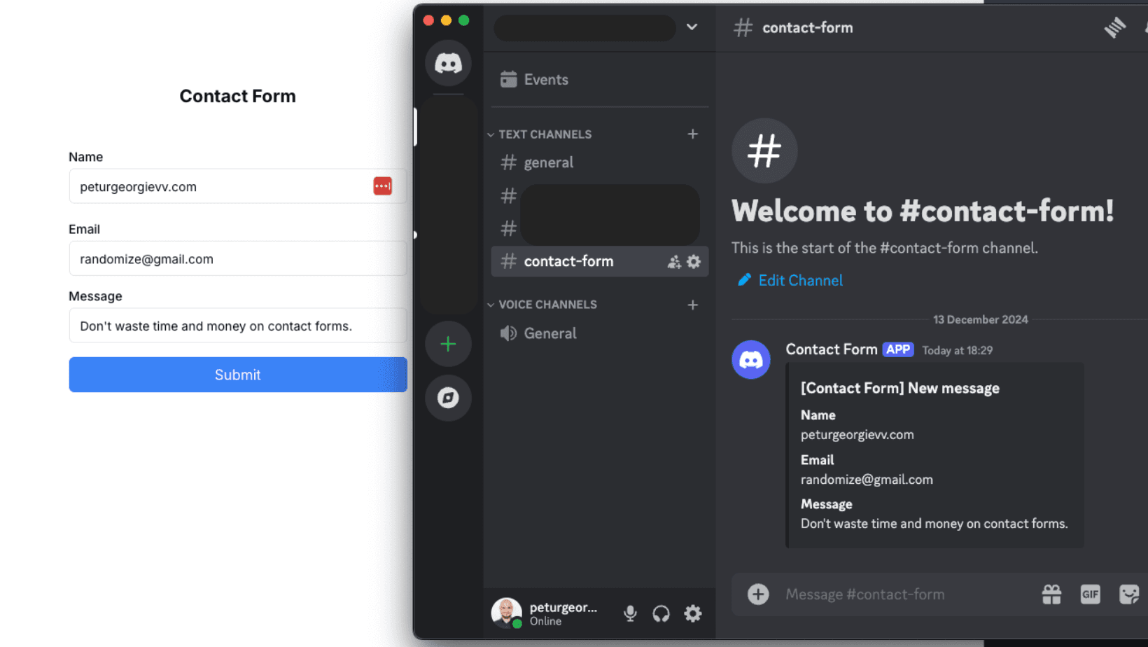
How to Create a Contact Form with Discord and NextJS (FREE)
How to avoid setting up STMP providers and complex email validations and create a discord channel to send contact forms information.

Create Production Dockerfile for NextJS - Deploy Everywhere
Dockerfiles aren't hard to do. You do it once per framerwork like NextJS and use everywhere!

How to Add Internationalization to NextJS app router (next-intl)
Adding internationalization is easier than it looks. Good apps benefit from it even if there is no need to have it. Improves code readability!
Complex Form with Zod, NextJS and TypeScript - Discriminated Union
Building big forms that have proper validation is not an easy task. Explore how to build complex form validations with Zod and its discriminated unions.
My Newsletter
Subscribe to my newsletter and get the latest articles and updates in your inbox!