Complex Form with Zod, NextJS and TypeScript - Discriminated Union
Building big forms that have proper validation is not an easy task. Explore how to build complex form validations with Zod and its discriminated unions.
Projects need forms. At least most of them. A performant solution for adding form validation to a NextJS project would be Zod and React Hook Form.
For simple use cases, it's pretty straightforward how to do it, but as forms get bigger and more complex everything starts to fall apart... I've had to do a form with 10+ different validations depending on one field and it became a mess.
I'll show here how to set up Zod validation, RHF with NextJS, and use discriminated unions. They allow us to build forms that dynamically change what is validated depending on a single field. You'll need a NextJS project up-running or use my basic starter from the branch base, it is with Tailwind and ShadcnUI.
Prepare our dependencies
Firstly, install Zod.
npm install zodTo build a form, we can use any library, but we'll go with Shadcn as it's prepared in our starter, or you can easily install it. If we're done with that, let's add a Form from their library and the Input as it's needed in the form itself.
npx shadcn@latest add form
npx shadcn@latest add input
This will create a form, button, label, and input components and install some dependencies like RHF to our project. For the sake of this tutorial, we won't extend the form component to make it more "ours", as this will be done in future articles for the starter.
We have more or less enough to continue with building our "app".
Create a simple form
We'll create a file for our form in the directory - common/simple-form/simple-form.tsx You could create a page, wrapper component, or anything needed to put your form in, it'll be the same. As we've chosen the common folder path, don't forget to add this code to your tailwind.config.ts, and import the simple form component inside app/page.tsx.
  content: [
    "./pages/**/*.{ts,tsx}",
    "./components/**/*.{ts,tsx}",
    "./app/**/*.{ts,tsx}",
    "./src/**/*.{ts,tsx}",
    "./common/**/*.{ts,tsx}", // <-- Add this line
  ],
To avoid overwhelming information, let's first create a simple form with the product name and description. Replace your content with the one below, and let's go over each part.
(You can use any type of UI library for the form, or none at all)
"use client";

import { Button } from "@/components/ui/button";
import {
  Form,
  FormControl,
  FormField,
  FormItem,
  FormLabel,
  FormMessage,
} from "@/components/ui/form";
import { Input } from "@/components/ui/input";
import { zodResolver } from "@hookform/resolvers/zod";
import { useForm } from "react-hook-form";
import { z } from "zod";

const productFormSchema = z.object({
  name: z.string().min(3, {
    message: "Name must be at least 3 characters.",
  }),
  description: z.string().min(10, {
    message: "Description must be at least 10 characters.",
  }),
});

type ProductFormSchema = z.infer<typeof productFormSchema>;

const SimpleForm = () => {
  const form = useForm<ProductFormSchema>({
    resolver: zodResolver(productFormSchema),
    defaultValues: {
      name: "",
      description: "",
    },
  });

  const onSubmit = (values: ProductFormSchema) => {
    console.log(values);
  };

  return (
    <div className="mx-auto max-w-[1170px] mb-8 mt-24">
      <Form {...form}>
        <form onSubmit={form.handleSubmit(onSubmit)} className="space-y-8">
          <FormField
            control={form.control}
            name="name"
            render={({ field }) => (
              <FormItem>
                <FormLabel>Name</FormLabel>
                <FormControl>
                  <Input placeholder="name" {...field} />
                </FormControl>
                <FormMessage />
              </FormItem>
            )}
          />
          <FormField
            control={form.control}
            name="description"
            render={({ field }) => (
              <FormItem>
                <FormLabel>Description</FormLabel>
                <FormControl>
                  <Input placeholder="description" {...field} />
                </FormControl>
                <FormMessage />
              </FormItem>
            )}
          />
          <Button type="submit">Submit</Button>
        </form>
      </Form>
    </div>
  );
};

export default SimpleForm;
Let's go over each part and explain different ways for improvement.
- The schema is defined above our component, it could be extracted in another file with its type.
- For the form validation, we use the useForm hook from RHF and validate it with the resolver for Zod.
- Putting initial (default) values is good practice if it's possible, or it could come from our BE, when in edit mode.
- Our submit handler that is used in the form. (currently just logging)
- The code for the form itself. It's generic and could be extended a lot.
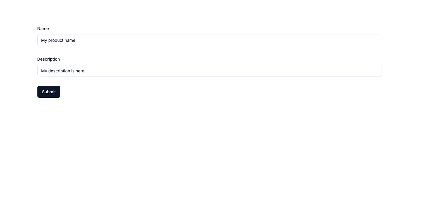
If you've followed so far, a screen similar to the one below should be present.
Add Zod Discriminated Union
For our example to be closer to a real-life one, we need logic around our form.
We'll have categories, and each one will have different required fields based on what we've chosen. Create a file in path constants/mock-categories.ts and add the following contents.
export const MOCK_CATEGORIES: { id: number; name: string }[] = [
  { id: 1, name: "Electronics" },
  { id: 2, name: "Books" },
  { id: 3, name: "Clothing" },
];
Now moving back to our form let's remove the description from the schema, to make our form smaller and add some additional fields, that will be modified later on.
const productFormSchema = z.object({
  name: z.string().min(3, {
    message: "Name must be at least 3 characters.",
  }),
  categoryId: z.number(),
  size: z.string().nullish(), // Clothing
  ram: z.string().nullish(), // Electronics
  pages: z.string().nullish(), // Books
});
The form default values could be changed as follows.
defaultValues: {
 name: ""
},
As you've noticed we have additional fields for each type of category. They should be dynamically shown depending on what you have selected, but for our use case let's add them all in our JSX to be easy to understand.
The categoryId should also be a Select of categories, but for the sake of a shorter tutorial, it'll be a number field. The below should be the final JSX, as we would only change the schema afterward. It adds inputs for each of our schema-defined fields. Side note on number fields, you might have to "register" them to be valueAsNumber to avoid parsing.
    <div className="mx-auto max-w-[1170px] mb-8 mt-24">
      <Form {...form}>
        <form onSubmit={form.handleSubmit(onSubmit)} className="space-y-8">
          <FormField
            control={form.control}
            name="name"
            render={({ field }) => (
              <FormItem>
                <FormLabel>Name</FormLabel>
                <FormControl>
                  <Input placeholder="name" {...field} />
                </FormControl>
                <FormMessage />
              </FormItem>
            )}
          />
          <FormField
            control={form.control}
            name="categoryId"
            render={({ field }) => (
              <FormItem>
                <FormLabel>Category ID</FormLabel>
                <FormControl>
                  <Input
                    type="number"
                    placeholder="Category ID"
                    {...field}
                    {...form.register("categoryId", { valueAsNumber: true })}
                  />
                </FormControl>
                <FormMessage />
              </FormItem>
            )}
          />
          <FormField
            control={form.control}
            name="size"
            render={({ field }) => (
              <FormItem>
                <FormLabel>Size</FormLabel>
                <FormControl>
                  <Input
                    placeholder="Size"
                    {...field}
                    value={field.value || undefined}
                  />
                </FormControl>
                <FormMessage />
              </FormItem>
            )}
          />
          <FormField
            control={form.control}
            name="ram"
            render={({ field }) => (
              <FormItem>
                <FormLabel>RAM</FormLabel>
                <FormControl>
                  <Input
                    placeholder="RAM"
                    {...field}
                    value={field.value || undefined}
                  />
                </FormControl>
                <FormMessage />
              </FormItem>
            )}
          />
          <FormField
            control={form.control}
            name="pages"
            render={({ field }) => (
              <FormItem>
                <FormLabel>Pages</FormLabel>
                <FormControl>
                  <Input
                    placeholder="pages"
                    {...field}
                    value={field.value || undefined}
                  />
                </FormControl>
                <FormMessage />
              </FormItem>
            )}
          />
          <Button type="submit">Submit</Button>
        </form>
      </Form>
    </div>
Now if we just submit the name with the correct input, everything should work and a console.log should be shown in the browser. Our next step is to create a new constant with the definition of a discriminated union depending on categoryId. Here each object is another "schema" that will override the main one if the condition for it is met.
- The first argument for discriminating unions is the field we're interested in changing.
- The second argument is an array of mini "schemas" and each of these must have the main field defined with a check for a literal or enum. Unions don't work here. I've tried...
const categoryDiscriminatedUnion = z.discriminatedUnion("categoryId", [
  z.object({
    categoryId: z.literal(1),
    ram: z.string({
      message: "RAM is required.",
    }),
  }),
  z.object({
    categoryId: z.literal(2),
    pages: z
      .string({
        message: "Pages is required.",
      })
      .min(5, {
        message: "Pages must be at least 5.",
      }),
  }),
  z.object({
    categoryId: z.literal(3),
    size: z.string({
      message: "Size is required.",
    }),
  }),
]);
For our union to be implemented, our main schema needs to know about it. This happens with the "and" operator. Replace our product form schema with the below one, that would be our final.
const productFormSchema = z
  .object({
    name: z.string().min(3, {
      message: "Name must be at least 3 characters.",
    }),
    categoryId: z.number(),
    size: z.string().nullish(), // Clothing
    ram: z.string().nullish(), // Electronics
    pages: z.string().nullish(), // Books
  })
  .and(categoryDiscriminatedUnion);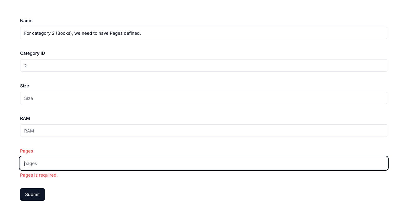
If you change the category ID, to be 1 or 3, another field validation would be needed.
From here you can extend it as much as you like. We've reduced the complexity, yet shown enough for you to understand how to move further. It takes a lot of testing and experimenting for a big form to be type-safe and with proper validations.
I'd suggest you extract all schema files into another file, generalize the form input creation, and reduce the code. It's up to your preference.
The full code from this tutorial is located in my NextJS starter in the zod-discriminated-union branch. It's not that hard, yet there are not enough examples of Zod usage.
If you're interested in more examples or tutorials, I'd love to hear your ideas. You can write me on Twitter/X or LinkedIn. At both places a follow is highly appreciated!
My newsletter will get you notified about any new articles coming out. You can subscribe below!
Related articles

How to improve your SaaS SEO & LLM's searches with NextJS (FAQs)
NextJS FAQs SEO boost. Increase your conversions with practial examples on improvements.
How to Create a Contact Form with Discord and NextJS (FREE)
How to avoid setting up STMP providers and complex email validations and create a discord channel to send contact forms information.

Create Production Dockerfile for NextJS - Deploy Everywhere
Dockerfiles aren't hard to do. You do it once per framerwork like NextJS and use everywhere!

How to Add Internationalization to NextJS app router (next-intl)
Adding internationalization is easier than it looks. Good apps benefit from it even if there is no need to have it. Improves code readability!
NextJS Starter with App Router - TailwindCSS + ShadcnUI (partially)
Craft an extendable starter with NextJS App router for use in your production apps. Use Tailwind and Shadcn for styling.
My Newsletter
Subscribe to my newsletter and get the latest articles and updates in your inbox!